3rd April 2017
Creating Charts with Microsoft Excel

Creating charts with Microsoft Excel 2013 has come a long way since previous versions. This blog briefly covers how to use the Chat Wizard.

As with anything in Microsoft Excel, when it comes to turning data into charts always stop and think about how the Wizard will interpret the data.
Even though the Wizard creates your chart, it still needs your help to do the job properly. It is important to take time and clearly plan how you want the chart to look as this will help when selecting the right chart from the Wizard.
By choosing the wrong type of chart you may still get a chart that looks good but doesn’t actually mean anything. If you experience problems with creating charts this usually means Microsoft Excel cannot make sense of the data you have selected within your spreadsheet.
Simple Concepts
The Chart Wizard requires two things to do the job:
- Numbers used for plotting: These are contained within rows/columns and are referred to as a data series
- Text (or numbers treated as text) referred to as the legend
Normally you will find that the column headings (first row) of the selected data will contain the titles of your data series, these will be used for the chart legend.
The row headings (first column) contains the labels for the x-axis (can be referred to as category labels). Data can be manipulated using the Wizard e.g. switching the data around / treat data as text.
The y-axis will be automatically created by Excel based on the numbers in your data, these are referred to as value labels.
Where to place your chart
Microsoft Excel allows you to place your chart on the same worksheet as your data or you can create a chart object as a sheet on its own. Both ways Microsoft Excel will automatically update your chart as the data is updated.
Creating your chart
Step 1: Select your data correctly
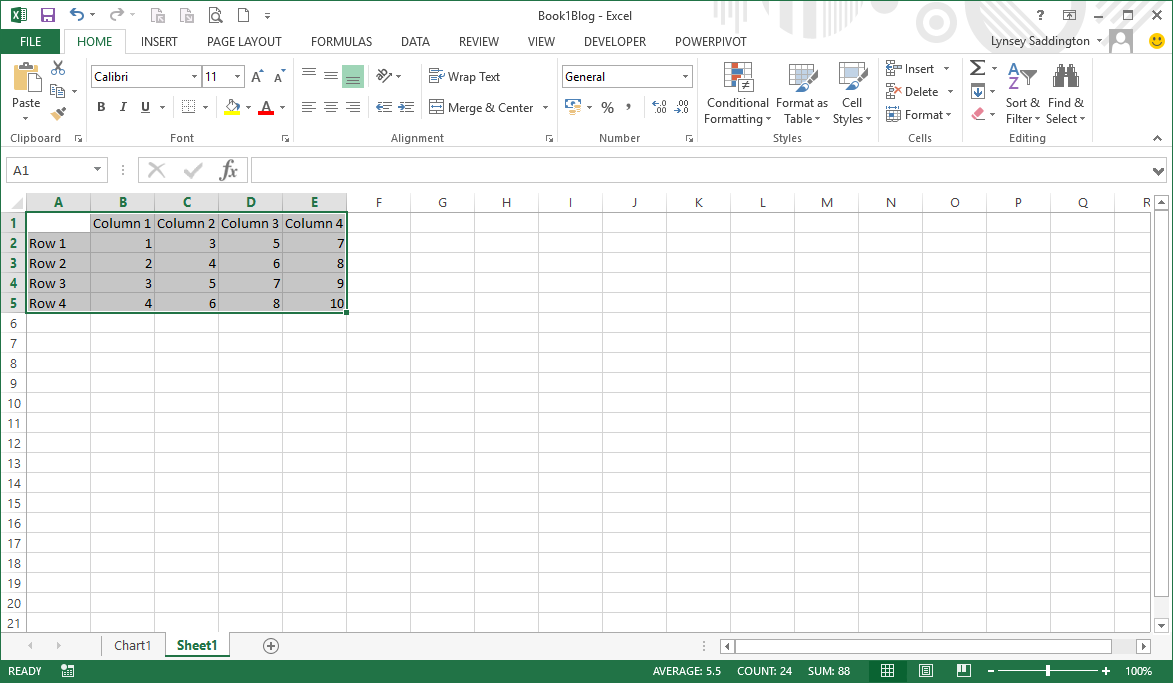
Step 2: Click on your required chart icon from the Ribbon or alternatively click on Recommend charts
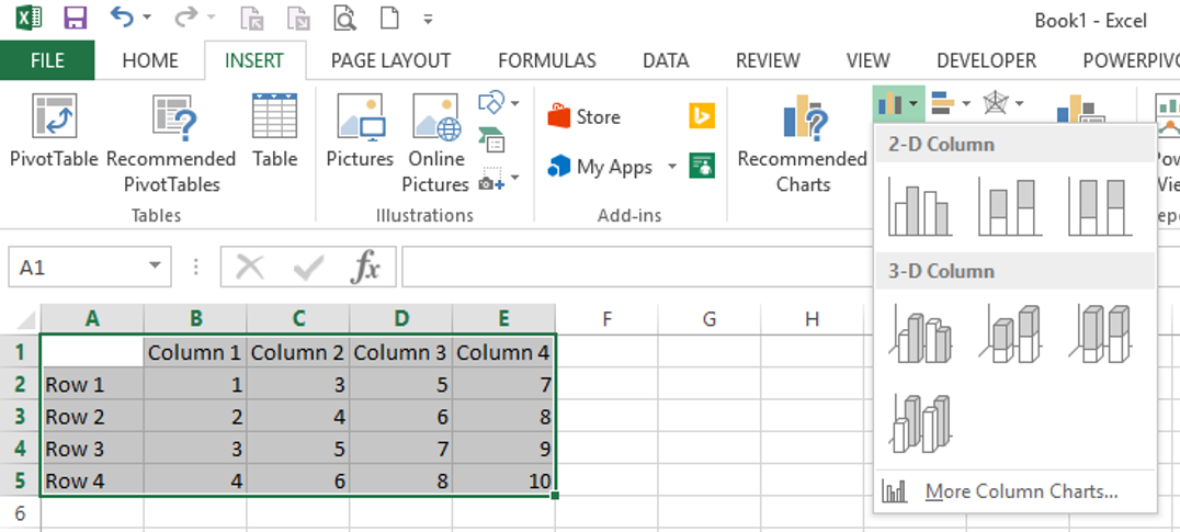
Example: selecting a chart icon
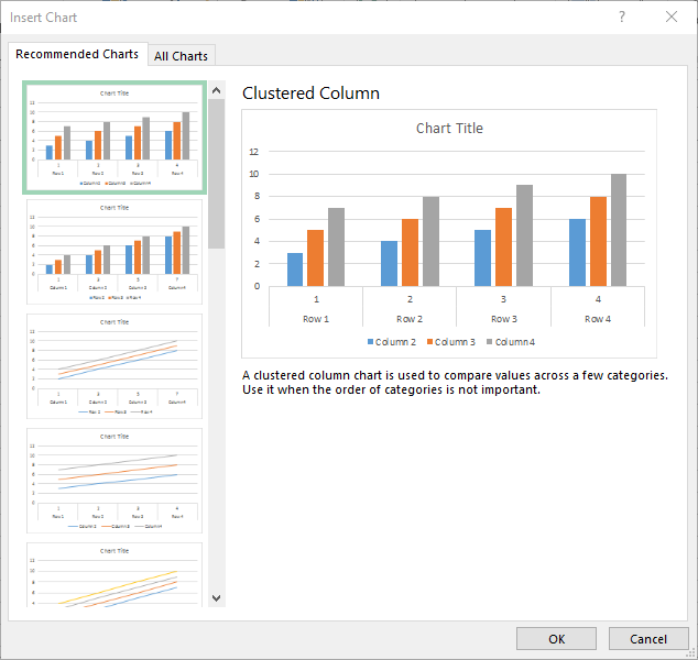
Recommend charts window
Step 3: As you hover over your chosen chart type Excel will show you a preview on the worksheet
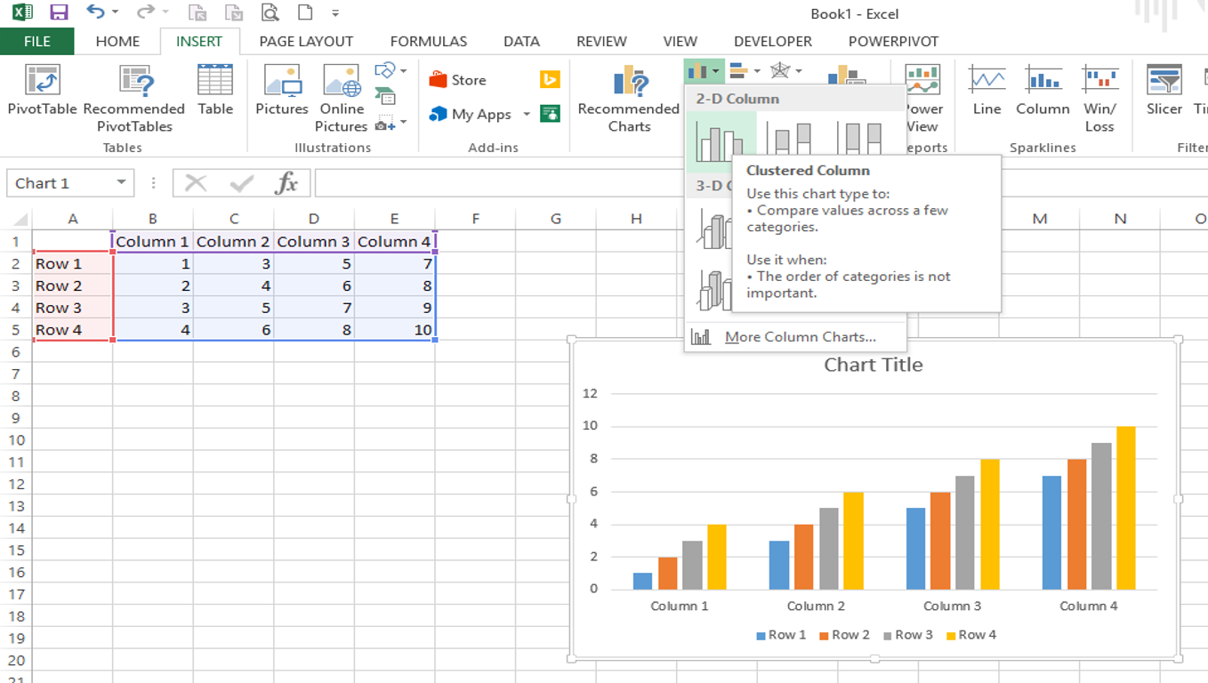
The following steps explain how to set your axis titles to show:
Step 4: When the chart is selected to the right hand side three icons will appear. Click on the Plus – this will show a pop-out menu
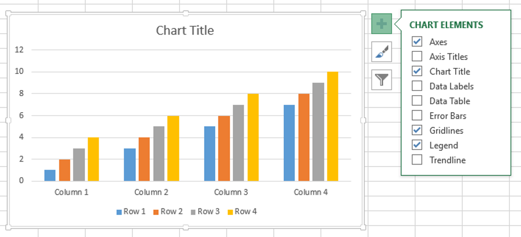
Step 5: Click in the Axis Title option this will add the titles
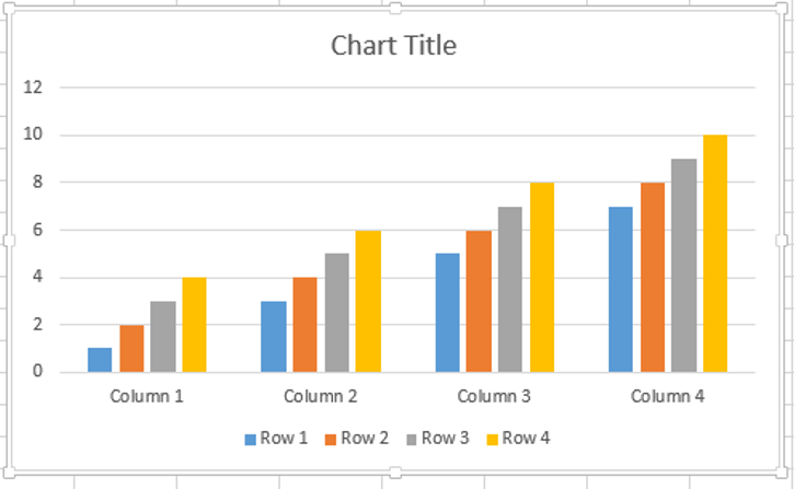
Step 6: Double click to edit the title and enter your axis title (horizontal axis (or x-axis) and vertical axis (or y-axis))
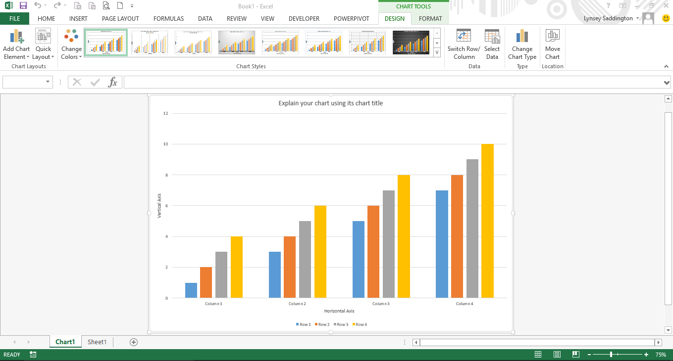
Step 7: Double click in the chart title and enter a chart title
The following steps explain how to change your chart to show on its own worksheet:
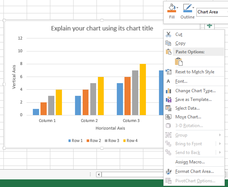
Step 8: Right mouse click on your chart, from the pop-out menu, click on the Move Chart option
Step 9: From the dialog window click in the New sheet radio button
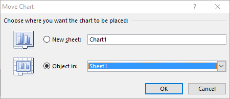
Step 10: Click on the OK button this will move your chart to its own worksheet
We hope you have found this useful, there will be more Excel blogs to follow.
